This document outlines the various functions of UI elements found on each Admin page.
Edit me
1. Sign Up
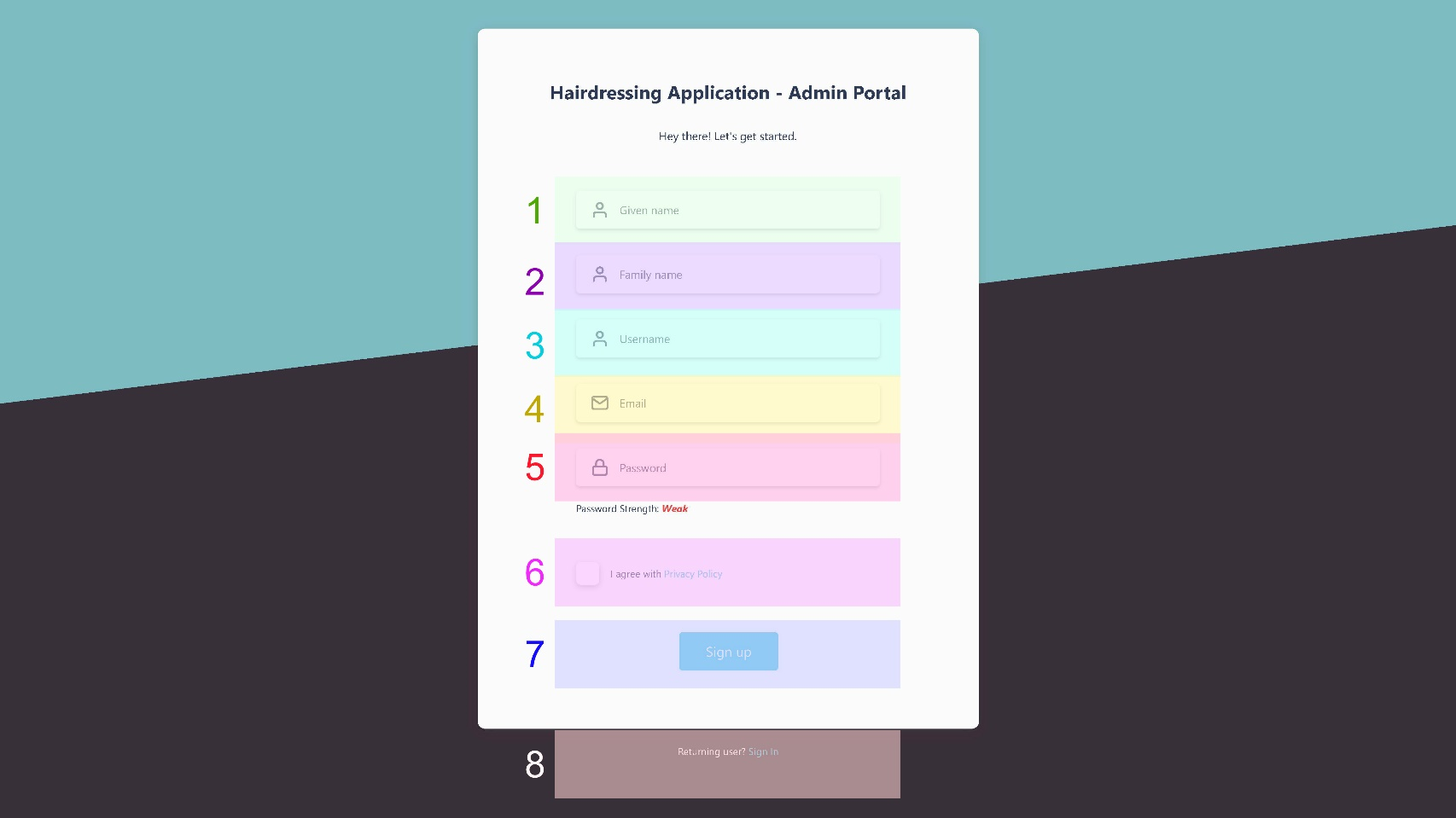
- Every new user must enter the details outlined above to register in the admin portal
- Basic password validation will make accounts slightly more secure
- A privacy policy might be written for the application itself rather than the admin portal
- The “Sign up” button should be greyed out if a required field is invalid
- The “Sign In” link conveniently redirects existing users to the sign in page
- Given name input required
- Family name input
- Username input required
- Email input required
- Password input required
- Privacy policy checkbox required
- Sign up button
- Sign in link
2. Sign In
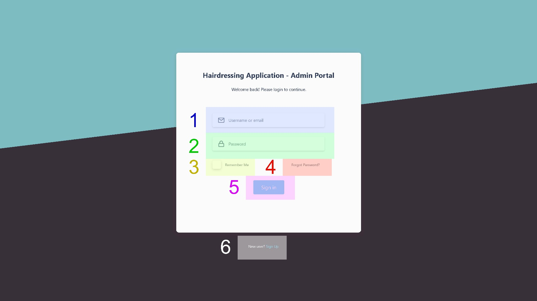
- Users have the option to enter either their username or email to sign in
- A pop-up message should be displayed if either field is incorrect
- Checking the “remember me” checkbox stores a token in the user’s browser that identifies them next time they access the admin portal
- The “forgot password” link should redirect users to the forgot password page
- The “forgot password” link should redirect new users to the sign up page
- Username or Email input required
- Password input required
- Remember me checkbox
- Forgot password link
- Sign in button (submit form)
- Sign up link
3. Forgot Password
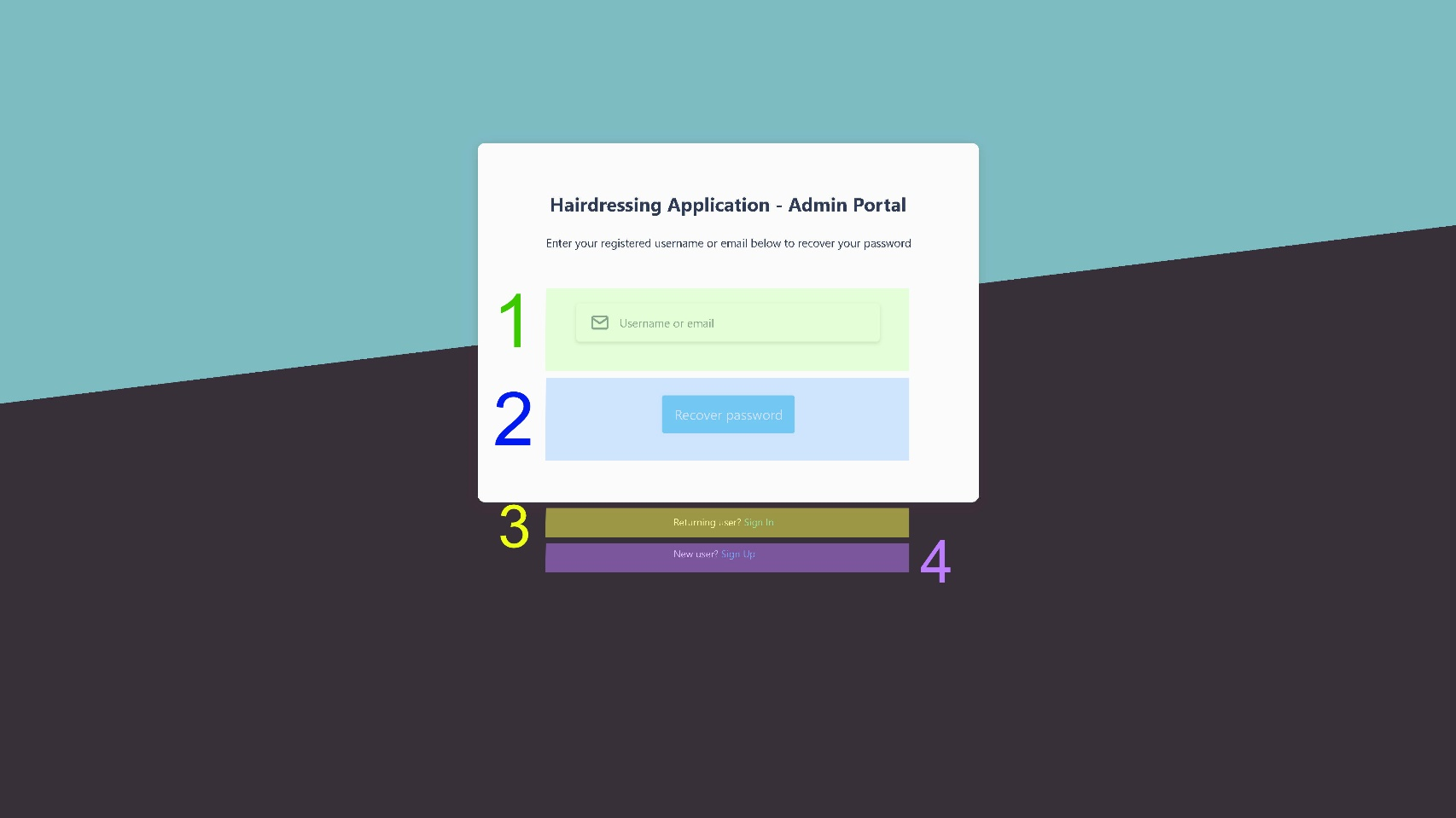


- Users can enter either username or email to recover their account
- If an account associated with the information entered is found, an email will be sent to the user with instructions on how to create a new password. Additionally, a success message should pop up at the top of the window to let the user know.
- If no account is found, an error message should pop up at the top of the window to inform the user.
- If the username/email input field is invalid or empty, the “recover password” button should be inactive.
- The sign in/ sign up links below the form should redirect users to the corresponding pages.
- Username or Email input required
- Recover Password button (submit form)
- Sign in link
- Sign up link
4. New Password
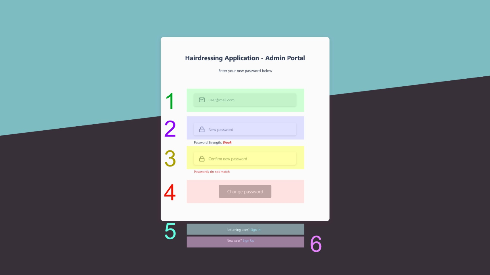
- The “email” field is read-only and lets users be aware of which email is associated with the account that they wish to recover.
- Both the “new password” and “confirm new password” input fields have basic validation and must match.
- If any of the fields is invalid, empty or the passwords do not match, the “change password” button should be inactive.
- If all inputs are valid, clicking on the “change password” button should redirect users to the dashboard page, with a success message at the top of the window informing them that their password has changed (possibly along with an email).
- The sign in/ sign up links below the form should redirect users to the corresponding pages.
- Email (read-only)
- New password input required
- Confirm new password input required
- Change Password button (submit form)
- Sign in link
- Sign up link
5. Dashboard
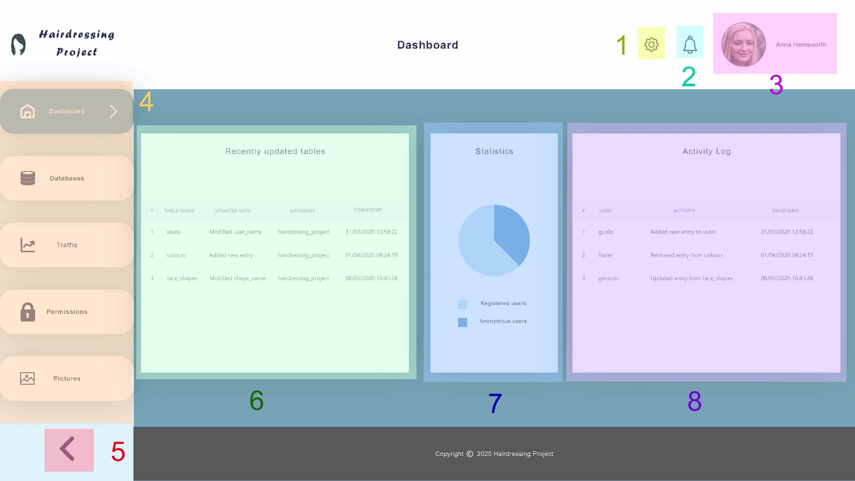
- The dashboard is the home page of the admin portal. It is the first page that users see after signing in.
- The settings button exposes a menu containing links for account information, logout and more.
- Clicking on the notifications button should show a small panel with the latest (important) changes in the databases or in the current user’s account, such as password or permissions. It should also display a switch button with the option to disable such notifications.
- The sidebar is the main navigation element of the admin portal. Clicking on each button should redirect users to the respective page.
- Recently updated tables should show which column/row has been modified, with the name of the respective table and database and a timestamp.
- The statistics section should display a simple pie chart or graph with useful data about users.
- Activity log refers to the latest changes specifically made by registered users of the application, with timestamp.
- Settings button
- Notifications button
- Profile picture and name
- Sidebar with links
- Collapse sidebar button
- Recently updated tables
- Statistics pie chart
- Activity log table
5.1. Dashboard - Settings dropdown
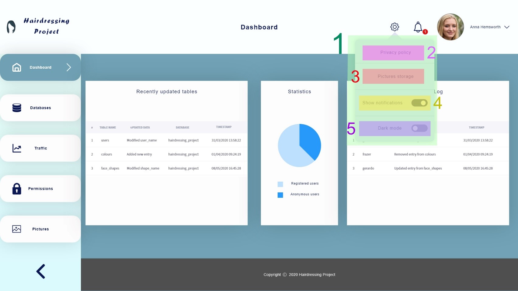
- This dropdown menu is displayed when users click on the settings (gear) icon.
- It provides four elements: a link to the application’s privacy policy (2), another link to the cloud instance where user pictures are stored (3), a toggle button to show or turn off notifications (4) and another toggle button to enable or disable dark mode (5).
- Clicking on the settings icon again or clicking anywhere outside of the settings dropdown (1) should close it.
- Settings dropdown
- Privacy policy link
- Pictures storage link
- Show notifications toggle button
- Dark mode toggle button
5.2. Dashboard - Notifications dropdown
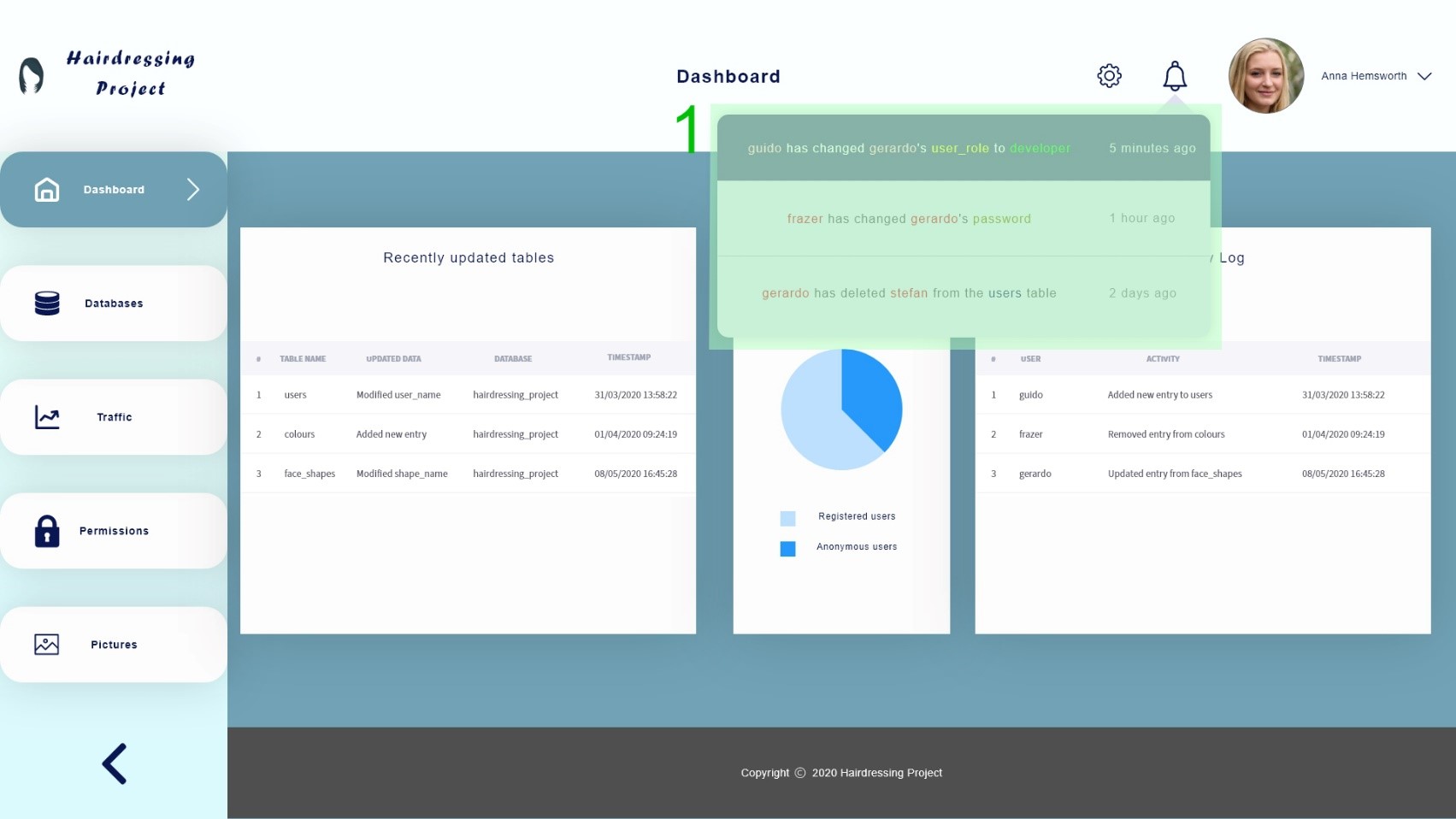
- This dropdown menu is displayed when users click on the notifications (bell) icon.
- The notifications to be shown should sorted by date/time (most recent ones at the top) and unread notifications should be highlighted (a badge with unread notifications count should also be displayed before clicking on the notifications icon).
- The nature of these notifications remains to be decided, although they should be relevant enough to not be spammy.
- Clicking on the notifications icon again or clicking anywhere outside of the notifications dropdown (1) should close it.
- Notifications dropdown
5.3. Dashboard - Account dropdown
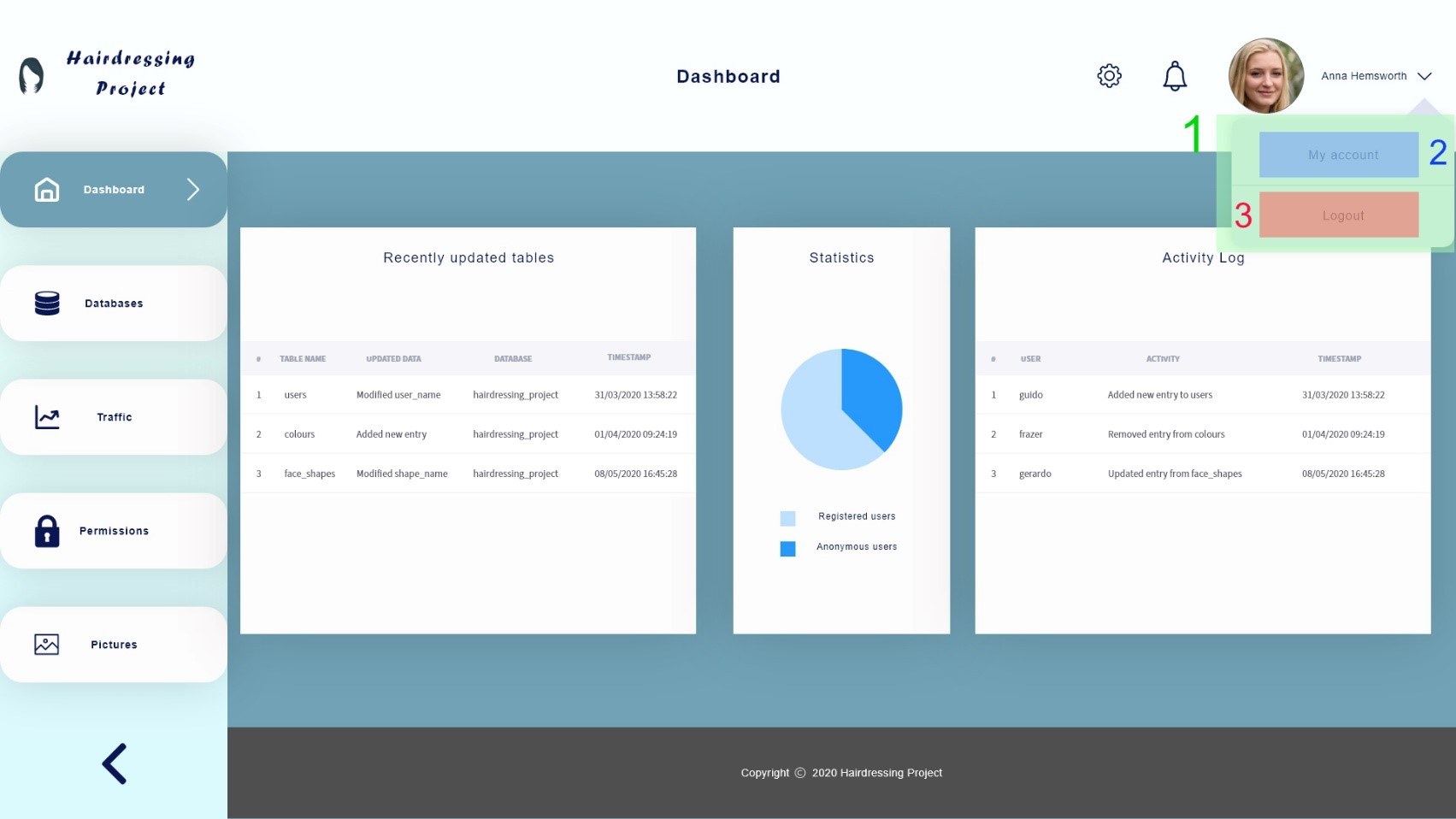
- This dropdown menu is displayed when users click on the small chevron (arrow) down at the right of the current user’s name.
- It should contain two links: “My account” (2) brings users to the My account page (see section 6 for more details) and “Logout” (3) ends the current session and redirects users to the Sign in page (see section 2).
- Clicking on the small chevron down again or clicking anywhere outside of the account dropdown (1) should close it.
- Account dropdown
- My account link
- Logout link
6. My Account
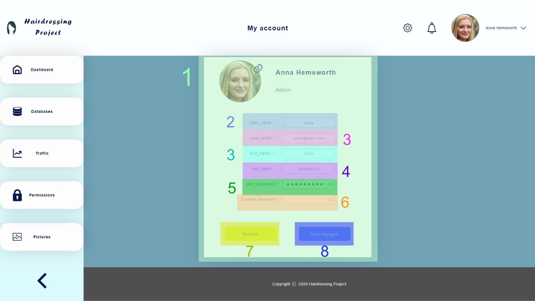


- This page should display the current user’s information and allow modifications.
- At the top of the account container (1), users should see their account’s profile picture (which can be changed by clicking on it), their first_name and last_name in the title and their user_role below their names. The user_role cannot be directly modified by the current user, an admin or another suitable user should do it for them.
- Any changes made to the current user’s account details should be saved (by clicking on the “Save changes” button (8)) to persist in the database, which should then bring users to the dashboard page and display a feedback message, as shown in the previous pictures. Before that, the current user must confirm their password in the “Confirm password” input field (6).
- The restore button (7) should overwrite all input fields with their respective initial states.
- See section 7.1 for more details regarding validation of input fields.
- Account container
- user_name input field required
- user_email input field required
- first_name input field required
- user_password input field required
- Confirm password input field required
- Restore all fields button
- Save changes button
7. Databases
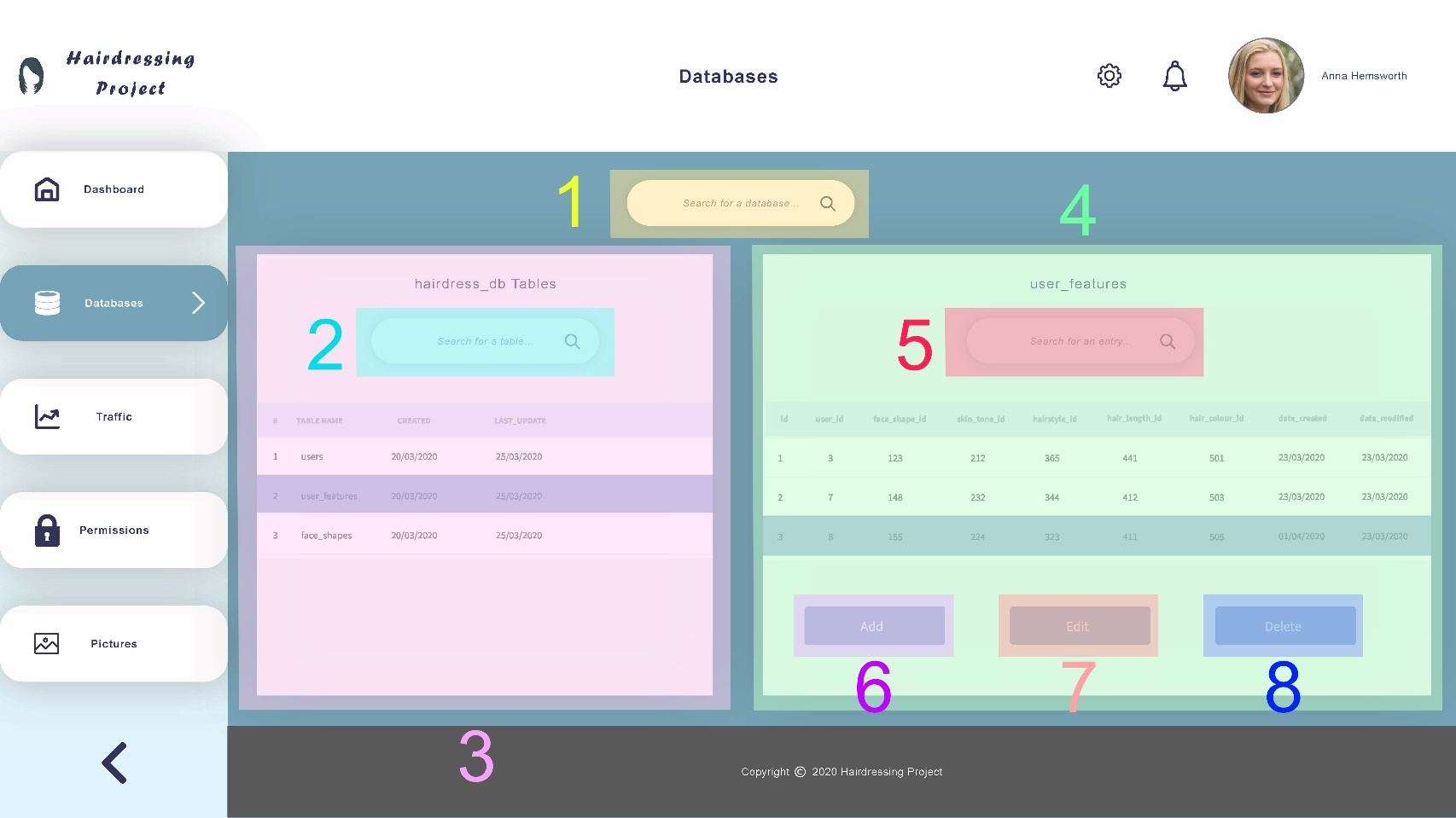
- The databases page should show all tables contained in each database (highlighted by (3)), with timestamps for created at and last updated dates.
- When users select a row in the tables section, a new section should pop up at the right (4), showing all entries of the table selected. If no row in the latter is selected, the “edit” and “delete” buttons should remain inactive.
- The search input fields (1, 2, 5) let users look for a specific database, table or entry, respectively. As they type, the respective table should automatically display only relevant results. Clearing a field should restore the respective table to show all records.
- The “add” button (6) allows users to create new entries in the selected table and the “edit” (7) and “delete” (8) buttons enable modification of the selected entry. See 6.1. (Add entry modal), 6.2. (Edit entry modal) and 6.3. (Delete entry modal) for more details.
- All other UI elements not outlined in the previous picture have already been covered.
- Search for a database input
- Search for a table input
- Tables section
- Entries section
- Search for an entry input
- Add new entry button
- Edit selected entry button
- Delete selected entry button
7.1. Databases - Add entry modal
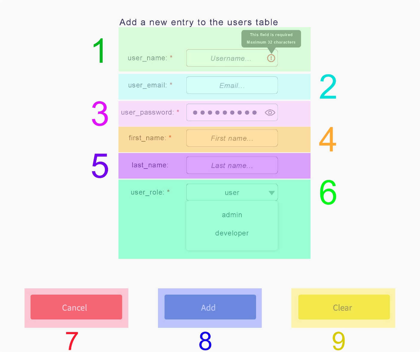
- The add entry modal should pop up when users click on the “add” button from the databases page.
- When users click on the “cancel” button (7) or when they click outside of this modal, it should close.
- When users click on the “clear” button (9), all input fields should be cleared.
- Fields marked with (*) are required. A validation tooltip should appear when an input field is invalid.
- The “add” button (8) should be disabled as long as at least one field is invalid or empty. If all fields are valid, it should turn active. Clicking on it should add a new entry to the selected table, close the modal and display a feedback message at the top of the window.
- TODO: Add error handling.
- user_name input field required
- user_email input field required
- user_password input field required
- first_name input field required
- last_name input field
- user_role dropdown required
- Cancel add entry button
- Add entry button
- Clear all fields button
Note: The users table was only shown as an example here. The same concepts apply to all other tables.
7.2. Databases - Edit entry modal
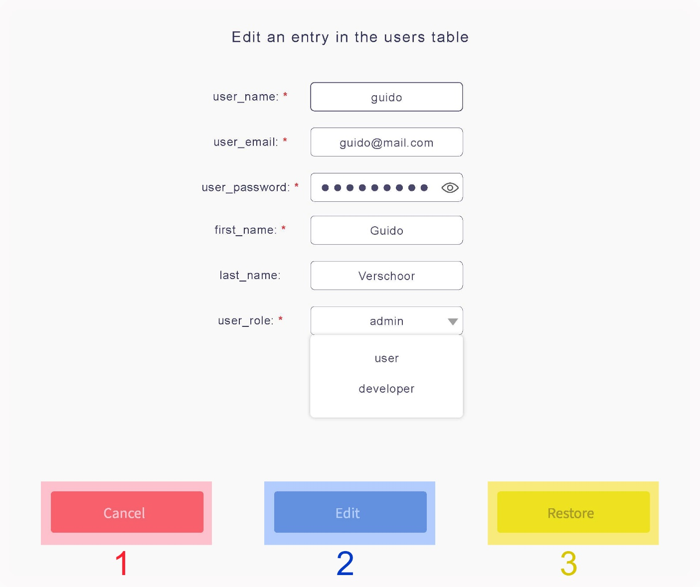
- The edit entry modal should pop up when users click on the “edit” button from the databases page.
- When users click on the “restore” button (3), all input fields should be overwritten with their respective initial values.
- The “edit” button (2) should be disabled as long as at least one field is invalid or empty. If all fields are valid, it should turn active. Clicking on it should edit the selected entry of the current table, close the modal and display a feedback message at the top of the window.
- Every other UI element not mentioned here works in the same way as 6.1.
- Cancel edit entry button
- Edit entry button
- Restore all fields button
7.3. Databases - Delete entry modal
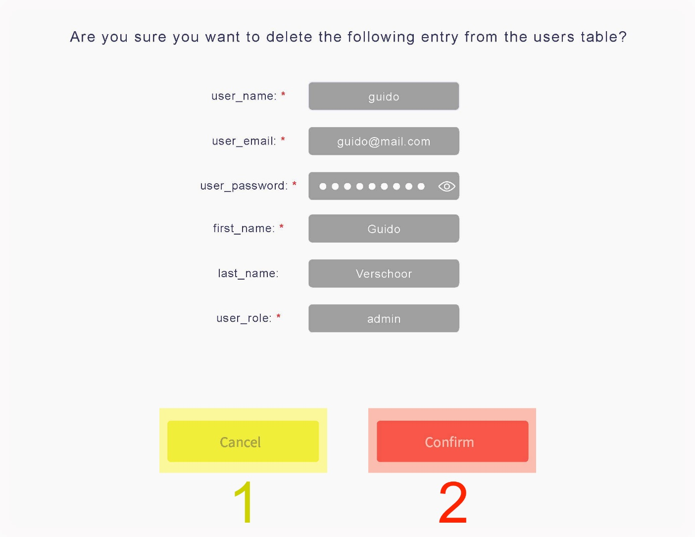
- The delete entry modal should pop up when users click on the “delete” button from the databases page.
- The “cancel” button (1) should close the modal and the “confirm” (2) button should delete the selected entry from the table, close the modal and then display a feedback message at the top of the window.
- In this modal all fields should be read-only, since there is no need to modify any of them.
- Cancel delete entry button
- Confirm delete entry button
8. Traffic
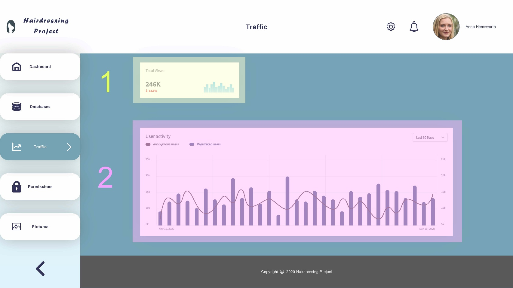
- The traffic page should show relevant data regarding usage of the Hairdressing application.
- The first section (1) should display the number of times that the application has been browsed so far. The total views could optionally count only unique users.
- The second section (2) should present a graph that summarises user activity in the Hairdressing application by date, which could distinguish registered users from anonymous ones.
- Ideally, a well-supported JavaScript library would be used to handle data visualisation for this page, so that users would be able to hover or click on specific points in the graph to see more details about the corresponding dates.
- All other UI elements not outlined in the previous picture have already been covered.
- Total views data
- User activity data
9. Permissions
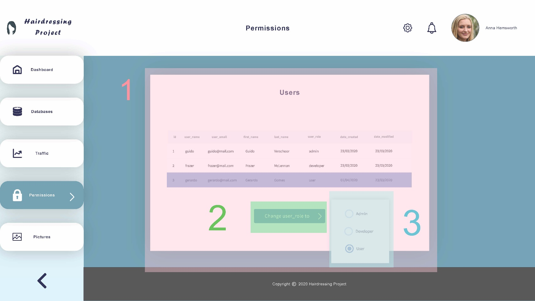
- The permissions page allows admins to change the role of any registered user. As such, it can only be viewed by users with “admin” as their user_role
- The main section of the page (1) shows all entries of the “users” table. If there is no entry currently selected, the “change user_role to” button (2) should be disabled.
- Once a user is selected, clicking on the “change user_role to” button (2) should open a small drop-right with all the available user roles as radio buttons (3).
- After a user role is chosen, the “users” table should be automatically updated. A feedback message should be displayed at the top of the page.
- All other UI elements not outlined in the previous picture have already been covered.
- Users table (main section)
- Change user_role to button
- User role drop-right
10. Pictures
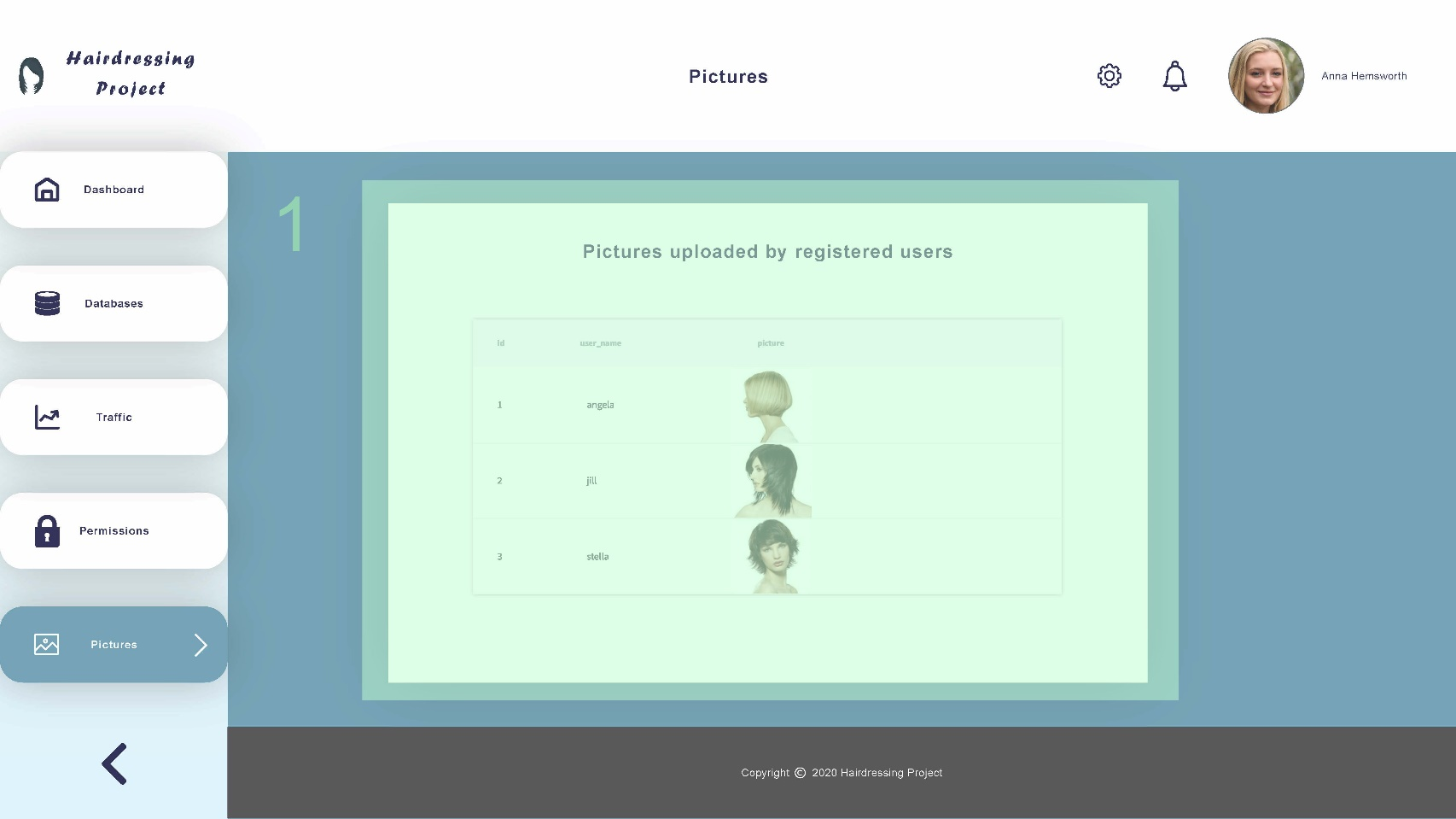
- The pictures page should display user-submitted pictures from the Hairdressing application. Those pictures are not present in the databases, they are stored in a separate cloud instance (possibly AWS S3), which is why this page is needed.
- The main section of this page (1) should show all pictures available in the cloud storage in a table, sorted by user/user id.
- Double-clicking on a row should bring users to the URL where pictures submitted by that particular user is stored in the cloud.
- Note: See the project specification document for more info about how pictures are handled in this project.
- All other UI elements not outlined in the previous picture have already been covered.
- Pictures uploaded (main section)